Rebuilding KYB Screening
October 2024
Ayn’s Know Your Business screening surfaced everything a compliance officer could legally need — and buried the one number they actually came for. We replaced an entity-by-entity card interface with a scannable table and a detail drawer.
Screening the company means screening its people — shareholders, directors, and owners, not just the parent entity.
Screening the company means screening its people
When you screen a business, the company name is only the surface. A company is a collection of individuals — shareholders, board members, owners — and proper compliance demands that every one of them is checked, not just the parent entity. This matters because the failure case is asymmetric: a company can come back completely clean while the people behind it carry real risk. Local jurisdictions flag individuals. Public watchlists name them. Adverse news attaches to them. A compliance officer who only reads the company-level result can approve a business whose majority shareholder is under a local alert.
Ayn handled this correctly at the data layer: screen the company, screen every associated person, return all of it. The problem was what happened between that data and the officer’s decision.
The problem: the answer was buried under an entity-by-entity slog
The original interface presented each associated entity as its own card. To answer the basic question — is there anything on this client? — an officer had to work through the entities one at a time: open this shareholder, note the screening results, open the next director, note theirs, and keep a running tally in their head. For a business with many associated people, that’s a lot of reading to reach a small answer.
Product analytics told us the feature wasn’t landing — engagement with it was poor. But analytics could only tell us that something was wrong, not what. The card layout wasn’t broken, the data wasn’t wrong, and nobody had filed a complaint that pointed anywhere specific. We were looking at a feature that was complete, correct, and quietly failing.
Two hypotheses about why officers open this page
Rather than restyle the cards, we went to the source and interviewed our clients. Going in, I framed the disagreement as two competing hypotheses about intent:
- Officers come to this page to read the full details of every associated entity’s screening results.
- Officers come to this page to see how many of the people associated with this client have a hit — and only then, selectively, dig into details.
The card design was an implicit bet on the first hypothesis. The interviews falsified it. Most compliance officers wanted a summary first: how many entities, how many with cases against them, who they are. Detail was a follow-up action for the rows that warranted it, not the starting point.
The interviews surfaced a second finding I hadn’t gone looking for: before Ayn, most of these officers ran their screening workflows in Excel. Their trained scanning behavior was rows and columns and counts — not cards. We had built a modern UI pattern for users whose expertise lived in spreadsheets, and in doing so we’d made experienced people slower at their own job.

Client interviews falsified the card design’s core assumption — and surfaced that officers’ trained instincts came from Excel, not modern UI.
The redesign: a table, because Excel got there first
Both findings pointed at the same structure, so the solution was almost forced once the intent was clear — which is exactly what good research should do.
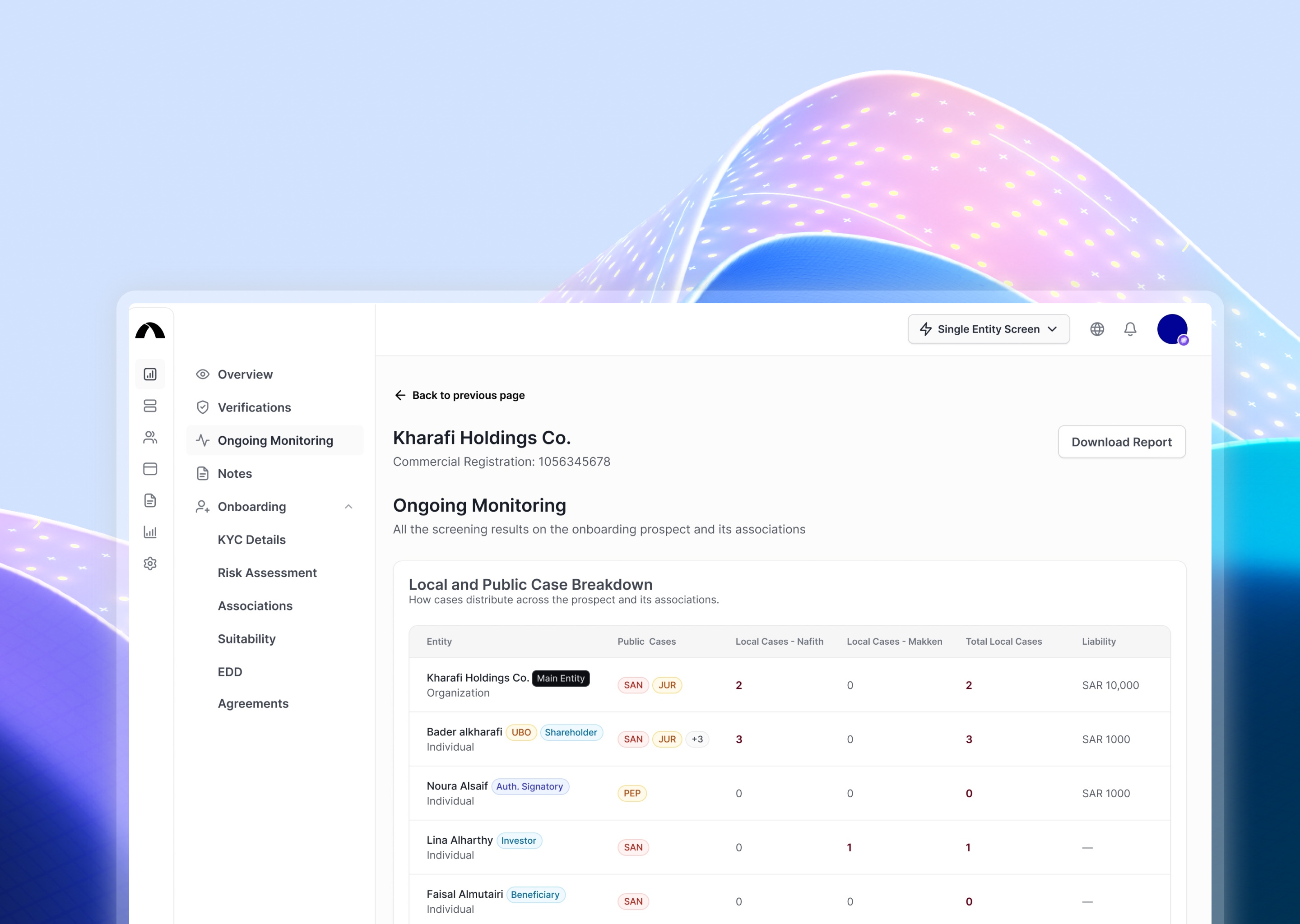
- The page became a table: one row per entity — the parent company and every associated person — with the number of cases against each. The question officers came with is now answered by reading a single column, in seconds, in the format their eyes were already trained on.
- Every row opens a side drawer with the full screening detail for that entity — the sources, the cases, everything the cards used to show. Nothing was removed; it moved one deliberate click away, and the drawer keeps the table in view so officers never lose their place in the scan.
One row per entity, case count read at a glance — the question officers came with, answered in seconds.
Choosing a table meant giving up visual richness for density, and it can read as a less “designed” screen than the cards it replaced. I’d argue the opposite: matching the users’ existing mental model was the design decision. The cards optimized for how the product looked; the table optimized for how the work is actually done.

From cards to columns — a screen built for how compliance officers already worked, not how the product happened to look.
Outcome
We tested the rebuilt feature with clients and it received a five-star rating — on a feature our analytics had previously flagged as underperforming. The scan-first, drill-second flow matched how compliance officers already worked, and the feedback reflected it.
Reflection
Two things stayed with me from this project. Analytics and interviews answer different questions— the numbers told us the feature was failing, but only sitting with users told us it was failing because we’d misread their intent. And users bring their previous tools with them: these officers’ fluency was built in spreadsheets, and honoring that fluency beat teaching them a prettier pattern. Since then, “what did they use before us?” has been one of the first questions I ask about any screen I design.